We are supported by our audience. When you purchase through links on our site, we may earn an affiliate commission, at no extra cost for you. Learn more. Last update on 30th June 2025 / Images from Amazon Product Advertising API.
Discovering the secrets of layers and blending has revolutionized my artwork, infusing it with captivating depth and vibrancy. Layering strategically and experimenting with blending techniques revealed a world of color and texture interplay. Understanding complementary shadows and utilizing blenders for seamless shifts elevated the visual impact of my pieces. By mastering when to cease layering, maintaining vibrant hues, and creating smooth gradients, my art attained a professional polish. Explore further into these techniques to enhance your own artwork’s allure and complexity.
Layering Techniques for Depth
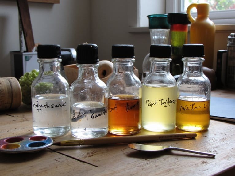
Layering colors strategically on a canvas can bring depth and vibrancy to a painting, transforming it into a dynamic work of art. Just like in Photoshop, where layer blending modes can enhance the overall look of a photo, blending colors in traditional painting is an art form that requires finesse and creativity.
When I paint, I often think of layering as akin to adding filters to photos in Photoshop. Each layer brings something unique, whether it’s luminosity, richness, or depth. By carefully blending colors and using different layer blending modes, I can achieve the desired effect in my artwork. It’s like creating a visual symphony where each layer plays an essential role in the final composition.
Experimenting with layering techniques allows me to explore the interplay of colors and textures. Just as in editing photos in Photoshop, where layers can be stacked and adjusted to create stunning effects, layering in painting offers endless possibilities. I can build upon translucent layers to avoid muddiness and maintain vibrancy, much like enhancing the clarity and brightness of a photo.
In essence, mastering layering techniques is like being a digital artist manipulating photos in Photoshop, only with a tangible and tactile medium. It’s about understanding how colors interact, how they blend, and how they can create a sense of depth and dimension in a painting.
Blending Colors for Realism
Blending colors skillfully is essential to achieving realism in your artwork. When working in Photoshop, mastering blending modes is vital for creating lifelike tones and textures. One effective technique is utilizing complementary colors for blending. By combining colors opposite each other on the color wheel, you can achieve a more natural and vibrant look in your artwork. Instead of using black for shadows, try incorporating complementary colors to maintain a sense of realism.
To enhance the depth and richness of your artwork, consider blending complementary colors with the principal color to create low chroma shadows. This technique adds complexity and dimension to your piece while keeping the colors harmonious. Experiment with different blending modes to find the perfect balance for your desired effect.
In addition to using complementary colors, employing a colorless blender can help achieve a seamless finish in your coloring. By layering colors with a light to medium touch, you can avoid over-saturation and maintain depth in your artwork. Knowing when to stop blending is crucial to prevent color loss and preserve the vibrancy of your piece. Mastering the art of blending colors will elevate the realism and visual appeal of your artwork.
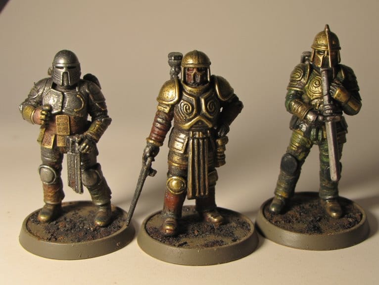
Utilizing Complementary Shadows
When it comes to making intriguing shadows in your art, the selection of complementary colors is crucial. By mixing shades like blues and oranges strategically, you can inject your artwork with depth and dimension. Trying out contrasting colors on the color wheel can result in impressive shadow effects that elevate the overall visual impact of your compositions.
Shadow Color Choice
In enhancing the depth and realism of your artwork, the strategic choice of complementary colors for shadows plays a pivotal role. When selecting shadow colors, consider using hues that are opposite each other on the color wheel. This technique can add dimension and a lifelike quality to your illustrations. Instead of relying on black for shadows, integrating complementary colors can infuse your artwork with vibrancy and dynamism. Pairing these shadows with your main color palette can create a harmonious visual impact. Experiment with blending modes in Photoshop to seamlessly merge complementary shadows with your base colors, elevating the overall appearance of your artwork.
Blending Techniques
Opting for complementary colors like orange and blue when shading can enhance the vibrancy and depth of your artwork through effective blending techniques. By steering clear of using black for shading and instead choosing complementary colors, you maintain the liveliness of your piece. Complementary shadows not only enrich the colors but also bring a sense of dimension without dulling the overall palette. I find that combining hues like red and green can produce striking shadows that captivate the eye. It’s all about experimenting with diverse complementary color schemes to elevate the impact of your blending technique. If you’re wanting to create artwork that pops with depth and richness, incorporating complementary shadows is key. Feel free to leave a comment below to share your experiences with blending techniques!
Depth and Dimension
To infuse your artwork with depth and dimension that mesmerize viewers, consider incorporating complementary shadows to accentuate the vibrancy of your colors. When exploring this technique, keep in mind these essential layering secrets for achieving dimensional effects through colorful shadows:
- Utilize Complementary Colors: Opt for complementary colors instead of black for shadows to create a dynamic and visually appealing effect in your artwork.
- Enhance Realism: Combine complementary colors with the principal color to produce low chroma shadows, adding realism and depth to your piece.
- Elevate Composition: Strategic use of colorful shadows can enhance the overall look of your artwork, creating a more visually interesting and enthralling composition.
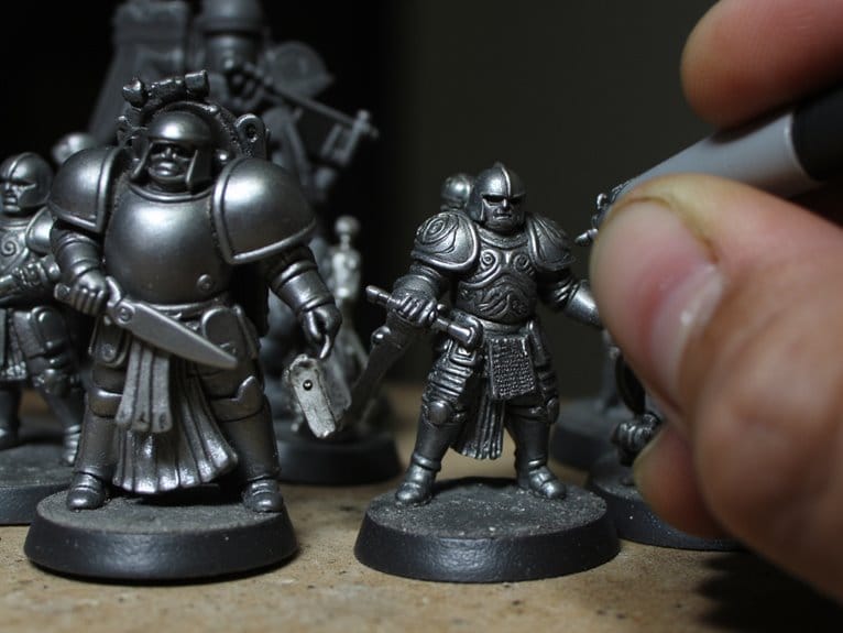
Seamless Transitions With Blenders
Blenders effortlessly weave together colors, creating seamless shifts that enhance the fluidity and harmony of artistic creations. When it comes to achieving flawless shifts in artwork, blending techniques are essential. By utilizing tools like blending stumps, tortillons, or brushes, artists can smoothly merge different hues to create gradients that add depth and dimension to their work.
Texture creation is another important aspect of using blenders effectively. With the right blending tool, artists can not only soften harsh edges but also create unique textures that bring their compositions to life. By layering colors and skillfully blending them, intricate textures can be achieved, adding complexity and interest to the artwork.
Layering secrets play an important role in seamless shifts. Blenders help artists blend multiple layers of colors to create a cohesive and professional finish. Whether it’s mixing colors to create a soft shift or enhancing the contrast between different elements, mastering blending techniques is key to achieving a polished look in your art.
Maintaining Vibrant Colors
When it comes to keeping colors vibrant in your artwork, understanding how to layer translucent hues can make all the difference. Mixing complementary colors can dull the vibrancy, so it’s best to avoid that route. Using colorless blender pencils is a handy trick to enhance and brighten colors while keeping them vivid.
Color Intensity Tips
Enhance the vibrancy of your colors by strategically layering high-quality pigments and avoiding overworking the paint. When aiming for intense colors, consider these tips:
- Utilize Color Saturation Techniques: Experiment with mixing pigments to find the perfect balance of color intensity.
- Master Layering Opacity: Control the opacity of your layers to build depth and richness in your artwork, enhancing color vibrancy.
- Explore Glazing Effects: Use transparent glazes to intensify colors without compromising their brightness or purity.
Blending Techniques for Vibrancy
To maintain the vibrancy of colors in your artwork, skillfully blend translucent hues to create depth and luminosity. By incorporating gradient layering techniques, you can enhance color depth and prevent shades from becoming muddy. Experimenting with vibrant blending techniques using sheer colors adds richness while preserving the vibrancy of your palette. When faced with dull or muddy tones, layering sheer colors on top can revitalize and restore the vibrancy of your composition. Embrace the unexpected beauty that comes from utilizing sheer colors, as they have the power to elevate the vibrancy of your artwork to new heights. Mastering these techniques will help you achieve stunning results that captivate and inspire viewers.
Avoiding Overblending Pitfalls
Managing the delicate equilibrium between merging colors smoothly and upholding their vibrancy is essential to evade overblending setbacks in your artwork. When it comes to blending, finding the perfect balance is key to maintaining the integrity of your colors while still achieving a harmonious shift between shades. Here are some tips to help you avoid overblending pitfalls:
- Brush Stroke Techniques and Color Preservation: Utilize varying brush stroke techniques to blend colors without sacrificing their vibrancy. Light, gentle strokes can help you layer colors effectively while preserving their individual hues. Leaving some visible brush strokes can also enhance the texture of your artwork, adding depth and interest.
- Layering Balance and Color Depth: Be cautious not to overblend your colors, as this can result in a loss of color depth and vibrancy. Experiment with different layering techniques to maintain the richness of your hues while achieving smooth shifts between shades. Building layers gradually can help you preserve the intensity of each color.
- Blending Finesse and Texture Enhancement: Aim for blending finesse by practicing subtle blending techniques that enhance the texture of your artwork. Avoid excessive blending, especially when working with colored pencils, to guarantee that your colors remain vivid and distinct. Embrace a balance between smooth shifts and visible textures to create dynamic and intriguing pieces.
Tips for Smooth Gradients
For achieving smooth shifts between colors, consider utilizing the gradient tool in Photoshop to create seamless gradients effortlessly. When aiming for smooth gradients, it’s important to maintain color harmony throughout the shift. Start by selecting colors that complement each other well, ensuring a visually pleasing blend. Gradient control is essential to achieving the desired effect. Adjusting the opacity and experimenting with blending modes can help in creating continuous shifts between colors.
To enhance the gradient’s depth and complexity, utilize multiple layers with varying opacities. This technique allows for more intricate gradient effects, adding depth and dimension to your design. Smooth shifts can be achieved by carefully blending different colors and adjusting the opacity of each layer accordingly. Experiment with different blending techniques to find the perfect balance for your project.
Layer masks are a valuable tool for controlling the visibility of gradient effects in specific areas. By using layer masks, you can refine the gradient’s appearance, ensuring a seamless integration with the rest of your design. Remember, practice makes perfect when it comes to mastering smooth gradients. Don’t be afraid to experiment and try out different combinations of colors and techniques to achieve the best results.
Enhancing Texture With Layers
Expanding on the captivating smooth gradients discussed earlier, let’s now explore how layering techniques can be utilized to enhance textures in artwork. Texture is an essential element that adds depth and visual interest to a piece, making it more engaging for the viewer. By strategically layering colors and utilizing different opacity levels, artists can create intricate textures that elevate their work to new heights.
Here are three key ways layering can enhance textures in artwork:
- Texture Varieties: Layering colors allows for the creation of various textures, ranging from smooth variations to more pronounced and tactile surfaces. By experimenting with different layering techniques, artists can achieve a wide range of textures that add complexity and richness to their artwork.
- Layering Radiance: Utilizing translucent colors on top of existing layers can enhance luminosity in the painting, creating a glowing effect that adds depth and dimension to the artwork. By playing with light and shadow through layering, artists can make their pieces more dynamic and visually striking.
- Establishing Depth: Building up layers of color can create a sense of depth in the artwork, making it more three-dimensional and immersive. By carefully layering colors to simulate distance and space, artists can bring their compositions to life and draw the viewer into the world they have created.
Knowing When to Stop
Knowing when to halt the layering process is a pivotal skill for artists seeking to maintain the vibrancy and clarity of their artwork. Recognizing boundaries in color layering is essential to avoid creating muddy tones that can dull the overall effect. When colors start to lose their vibrancy and become muddy, it’s time to stop layering to prevent a lackluster outcome.
Effective blending techniques play an essential role in determining when to stop layering. By strategically adding sheer colors on top of muddy hues, artists can transform unexpected beauty from what was once considered dull. Experimenting with sheer colors can help revive the vibrancy and depth of the painting, adding luminosity and dynamic effects.
Adding more color once the initial layers have dried can enhance the richness and intensity of the artwork. This technique allows for a more layered and textured appearance without compromising the clarity of the colors. By understanding the right balance between layering and blending, artists can achieve a harmonious and vibrant composition. Knowing when to stop is not only about restraint but also about enhancing the overall impact of the artwork through thoughtful and deliberate color application.