We are supported by our audience. When you purchase through links on our site, we may earn an affiliate commission, at no extra cost for you. Learn more. Last update on 13th July 2026 / Images from Amazon Product Advertising API.
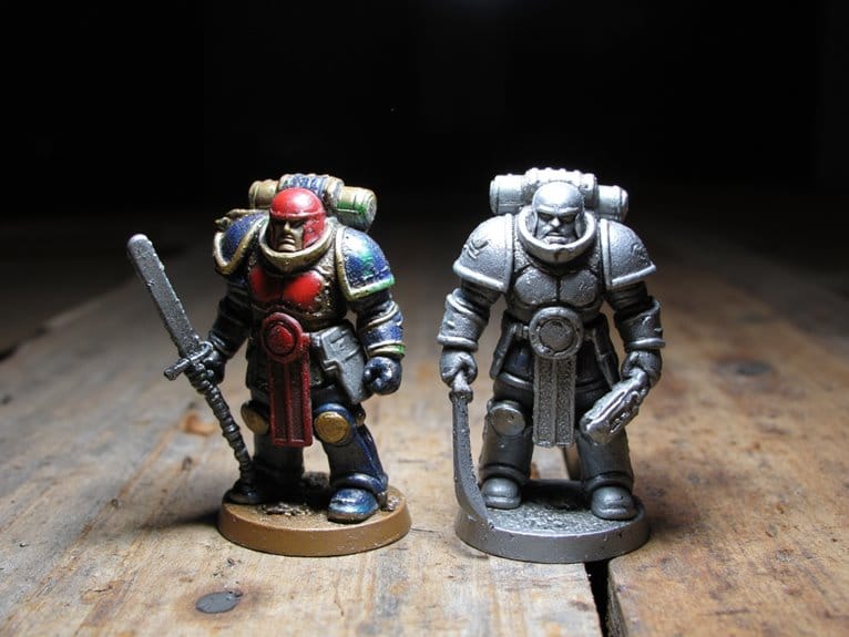
To paint cloaks and robes effectively, carefully select a color palette based on the desired impact and character traits. Utilize warm hues for energetic characters and cool tones for sophistication. Understanding color theory is key, with complementary colors creating striking contrast and analogous colors blending seamlessly for unity. Master base coat techniques by adjusting water dilution, layer mid-tones strategically for depth, and apply highlights with brushstroke variation for realism. For a lifelike texture, blend shadows and highlights, layer multiple hues, and focus on fabric mimicry. Layering colors enhances depth, while varnish seals and protects the final masterpiece. Mastering these techniques will elevate your miniature painting skills significantly.
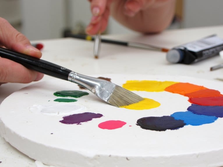
Choosing the Right Color Palette
When choosing colors for painting cloaks and robes, it is important to ponder the desired impact on the observer and the character’s characteristics. The base coat or base color sets the tone for the entire design. Understanding the character’s background is vital as it influences the choice of colors. For instance, warm colors like reds, oranges, and yellows can be selected for characters with vibrant and outgoing personalities. These hues not only catch the eye but also convey a sense of energy and dynamism. On the other hand, cool tones such as blues, purples, and greens are ideal for characters who exude mystery and elegance. These colors create a more subdued and sophisticated look, perfect for enigmatic or regal figures.
Moreover, neutral shades like browns, greys, and blacks offer a versatile option that can complement various miniature themes and settings. When considering the character’s environment, these neutral colors can help the miniature blend seamlessly into different scenes. By taking into account the character’s background, personality traits, and the world they inhabit, you can create a cohesive and visually appealing color palette that enhances the storytelling aspect of the miniature. Experimenting with different color combinations and tones allows for a more nuanced and engaging portrayal of the character through their cloak or robe.
Understanding Color Theory
Exploring the principles of color theory illuminates the dynamic interplay between different hues and their impact on visual perception in miniature painting projects. Color theory serves as the foundation for understanding how colors interact with each other, influencing the overall aesthetics of a painting. The color wheel, a fundamental tool in color theory, categorizes colors into primary, secondary, and tertiary groups, showcasing their relationships and possibilities for combinations.
One key concept in color theory is the notion of complementary colors, which are situated opposite each other on the color wheel. When used together, complementary colors intensify each other, creating a striking contrast that can be effectively utilized in highlighting details or creating focal points on cloaks and robes in miniature painting. On the other hand, analogous colors, which are adjacent to each other on the color wheel, blend harmoniously and can be employed to convey a sense of unity and coherence in the color scheme of a miniature project.
Understanding color theory provides painters with the knowledge needed to choose colors that work well together, enhancing the visual impact of their miniature painting. By grasping the principles of color relationships and the effects they produce, painters can elevate their artistry and create compelling cloaks and robes that stand out in detail and vibrancy.
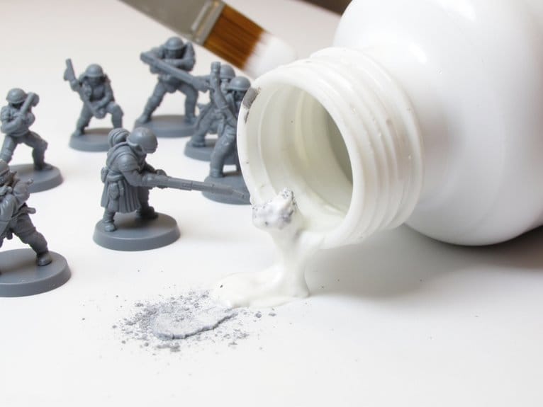
Applying Base Coat Effectively
To achieve a seamless initial layer on the cloak, make sure the paint is thinned adequately for even coverage and adherence, using water as needed to preserve detail clarity on the miniature. The key to a successful initial layer lies in the proper balance of water dilution and paint consistency. Too thick of a paint mixture can result in a uneven application, while too thin can lead to a lack of coverage. By finding the right mix, you guarantee a smooth application that sticks well to the miniature without obscuring its intricate details.
When applying the initial layer, consider the direction of light on the miniature. Highlight areas that are more exposed to light with a lighter shade, mimicking how light would naturally interact with the fabric. Blend these highlights with the initial layer using a soft brush to create natural shifts and avoid harsh lines. This technique not only adds depth to the cloak but also enhances its realism.
Focus on painting the edges and folds of the cloak during the initial layer stage. By emphasizing these areas, you create shadows and highlights that contribute to the overall dimension of the fabric. Mastering the art of initial layer blending and highlighting based on the light source will establish a strong foundation for the subsequent painting stages.
Mastering Mid-tone Application
I will highlight the significance of layering to create depth in the cloak or robe through the use of the mid-tone color. Employing blending techniques with the mid-tone helps smoothly merge the base coat and highlights, ensuring a natural shift. Mastering the mid-tone application is essential for defining the larger areas of the garment, leading to a realistic and visually appealing finish.
Layering for Depth
Layering mid-tone colors is a fundamental technique for adding depth and realism to cloak painting. When focusing on this aspect, it’s essential to contemplate shadow placement, fabric texture, and light source influence:
- Shadow Placement: Strategically situating shadows where the fabric folds or drapes can enhance the three-dimensional effect, giving the cloak a more realistic appearance.
- Fabric Texture: Layering different shades of the mid-tone color can mimic the texture of various fabrics, making the cloak look more tactile and visually compelling.
- Light Source Influence: Understanding how light interacts with the cloak helps in determining where to apply darker mid-tones for shading and lighter mid-tones for highlighting, creating a sense of volume and form.
Blending Techniques
Blending techniques play an essential role in mastering the application of mid-tones to achieve a professional and well-blended finish on cloaks and robes. Shadow placement is pivotal when applying mid-tones as it helps in creating depth and dimension in the fabric. By strategically blending the mid-tone with the base color using a makeup brush, a smooth shift between light and dark areas can be achieved. Fabric texture is also a key factor to ponder; applying the mid-tone with a light touch and precise blending technique can help in creating a natural look. Gradient blending on raised areas and folds enhances the realism of the cloak or robe, making mastering mid-tone application crucial for achieving a professional outcome.
Perfecting Highlighting Techniques
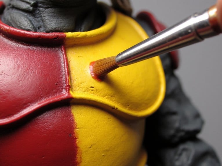
When highlighting cloaks and robes, it’s important to pay attention to the brushstroke direction for a seamless finish. Layering different shades to create depth is essential in achieving a realistic look. By mastering these techniques, you can elevate your painting skills and bring your miniature figures to life.
Brushstroke Direction Tips
To achieve peak highlighting techniques when painting cloaks, mastering brushstroke direction is essential for enhancing realism and depth. When focusing on brushstroke direction, several key factors come into play:
- Brushstroke variation: Experiment with different pressures and angles to create a natural highlight effect.
- Highlight placement: Align brushstrokes with the cloak’s folds to accentuate depth and dimension.
- Texture creation: Utilize diagonal strokes for blending colors smoothly and shifting between shades seamlessly. By incorporating these techniques, one can achieve a cohesive and visually appealing finish to the highlighting process.
Layering for Depth
Layering multiple hues of the same color on a cloak creates a sense of depth and dimension, enhancing the overall realism of the highlighting techniques. Shadow placement is vital in adding depth; darker tones should be strategically placed in areas where light would naturally be obstructed, such as folds or underneath overlapping layers. Gradient shifts between the different shades help create a smooth shift from dark to light, giving the illusion of three-dimensionality. Highlight placement is equally important; using a lighter hue on raised surfaces or areas hit directly by light emphasizes the shape and texture of the fabric. By blending these hues seamlessly and paying attention to light sources, a natural and lifelike effect can be achieved, elevating the cloak’s appearance.
Blending for Realistic Texture
Blending with a makeup brush enables me to achieve smooth shifts between colors on cloaks and robes, enhancing the overall realism of the texture. By carefully blending different shades, I can create gradients that mimic the natural variations seen in fabric. This technique is vital for achieving a lifelike appearance on the cloak or robe I am painting.
Blending for Realistic Texture:
- Texture Application: Applying layers of paint with a makeup brush helps in building up the texture of the fabric. The brush strokes can mimic the weave or flow of the garment, adding depth to the overall look.
- Shadow Placement: Gradually introducing darker hues in the creases and folds of the cloak or robe creates realistic shadows. This technique provides depth and dimension to the garment, making it appear more three-dimensional.
- Highlight Blending: Focusing on blending the highlights with the base coat along the edges and folds of the fabric is essential for adding dimension. This technique creates a realistic play of light and shadow, bringing the cloak or robe to life.
Layering Colors for Depth
Building depth in painted cloaks and robes involves strategically layering colors from the base to highlights, creating a nuanced and dimensional appearance. This process of color layering is essential for achieving a realistic and visually striking look. By utilizing gradient blending techniques, artists can seamlessly shift from one shade to another, enhancing the depth and texture of the fabric.
Color layering is a fundamental aspect of depth creation in painted cloaks and robes. Starting with a base color, gradually incorporating mid-tones, and finishing with highlights adds complexity and dimension to the garment. This method mimics the way light interacts with different parts of the fabric, making it appear more lifelike. To execute this effectively, artists can use makeup brushes for precise blending, ensuring a smooth and professional finish.
Specific colors such as Mars red and wasteland soil can play an essential role in enhancing the depth of cloaks and robes. These shades can be strategically applied to create shadows, highlights, and mid-tones, adding depth and richness to the overall appearance. By layering these colors thoughtfully and focusing on gradient blending, artists can achieve a dynamic and eye-catching result that brings the fabric to life.
Sealing With Varnish for Protection
To protect painted cloaks and preserve their appearance, applying matte varnish serves as a crucial step in maintaining the integrity of the artwork. Matte varnish provides a protective layer over painted cloaks, preventing chipping and wear. Here are some key points to keep in mind when sealing your painted cloaks with varnish:
- Varnish application, drying time: When applying matte varnish to your painted cloaks, ensure consistent coverage using a brush or spray. Allow sufficient drying time between coats as per the manufacturer’s instructions to achieve a smooth and protective finish.
- Protective benefits, longevity: Matte varnish helps seal and safeguard the paint job from handling, dust, and moisture, extending the longevity of the artwork. By adding this protective layer, you can enjoy your painted cloaks for years to come without worrying about damage or fading.
- Matte finish, professional look: Opting for matte varnish on cloaks provides a professional and finished appearance without unwanted shine or gloss. The varnish can also enhance the colors of the cloak, giving it a more polished and refined look suitable for display or wear.