
We are supported by our audience. When you purchase through links on our site, we may earn an affiliate commission, at no extra cost for you. Learn more. Last update on 30th June 2025 / Images from Amazon Product Advertising API.
Color theory serves as your roadmap for transforming miniatures through strategic color choices that create depth and visual impact. You’ll master the color wheel‘s primary, secondary, and tertiary relationships while understanding hue, value, and chroma as your fundamental building blocks. Complementary colors deliver maximum contrast, while analogous schemes provide natural harmony. Value modulation creates three-dimensional form, and chroma adjustments establish visual hierarchy. These principles reveal advanced techniques that elevate your painting craft.
Notable Insights
- Master the color wheel fundamentals: primary, secondary, and tertiary colors to improve mixing strategies and achieve precise color control.
- Use complementary colors strategically for maximum contrast while varying saturation and value to avoid unnatural clashes.
- Apply analogous color schemes with adjacent hues to create natural harmony and simplify blending techniques.
- Balance warm and cool temperatures using 70-30 ratios, with warm colors advancing and cool colors receding for depth.
- Modulate value from light to dark to transform flat surfaces into three-dimensional forms with proper volume.
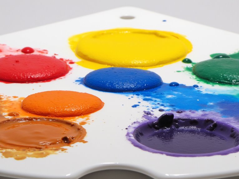
Understanding the Color Wheel and Its Components
Whether you’re painting Space Marines or fantasy warriors, the color wheel serves as your fundamental roadmap for understanding how colors interact and influence each other. This circular arrangement organizes primary, secondary, and tertiary colors in systematic visual relationships that guide artistic expression.
The color wheel’s structure enables precise color mixing by positioning complementary colors directly opposite each other and analogous colors adjacent. You’ll manipulate color saturation through tints (color plus white), shades (color plus black), and value adjustments from 1 (black) to 10 (white). This foundational tool has historical roots tracing back to philosophers and scientists who first explored the principles of color mixing and light influence.
These painting techniques create depth and contrast essential for miniature work. Understanding these components allows strategic color adjustments across artistic palettes, reducing guesswork while maximizing visual impact on your miniatures. The traditional seven-color arrangement includes warm colors positioned on one side and cool colors on the opposite side, helping you make informed temperature decisions when highlighting armor or painting skin tones.
Primary, Secondary, and Tertiary Colors in Miniature Painting
When building your miniature painting palette, mastering the three fundamental color categories—primary, secondary, and tertiary—provides the foundation for every successful paint scheme.
Primary color significance lies in red, blue, and yellow serving as pure hues that can’t be mixed from other colors. These establish your palette’s core strength.
Red, blue, and yellow form the unbreakable foundation—these pure hues cannot be created from mixing other colors.
Secondary color dynamics emerge when you mix primaries in equal parts: red plus yellow creates orange, yellow plus blue produces green, and blue plus red forms violet. This doubles your available hues from three to six colors.
Tertiary color nuances develop by combining adjacent primary and secondary colors, yielding twelve total hues including red-orange and blue-green. With strategic color mixing, you can create approximately 170 colours from just five primary pigments, dramatically expanding your painting options beyond pre-mixed commercial paints.
Effective color mixing strategies and color contrast techniques rely on understanding these relationships to create balanced, visually compelling miniatures. Understanding warm and cool color temperatures within your palette enhances the emotional impact and visual harmony of your painted miniatures.
Hue, Value, and Chroma: The Building Blocks of Color
While primary and secondary colors form your palette’s foundation, mastering the three distinct properties that define every color—hue, value, and chroma—elevates your miniature painting from basic color application to sophisticated artistic control.
Hue represents the color’s position on the color wheel. Red, blue, and green are distinct hues.
Value measures lightness or darkness on a scale from 0 (black) to 11 (white). Squinting helps discern different values when examining your miniature’s surface details and shadows.
Chroma indicates saturation intensity from 0 (grey) to 16+ (maximum vibrancy). Complementary color mixing creates new hues rather than merely graying them when adjusting chroma levels.
Understanding hue effects helps you create harmonious color schemes using analogous or triadic combinations.
Value scales enable proper shadow-to-highlight shifts for dimensional depth. Quality miniatures should maintain color saturation over time with consistent paint applications that resist fading.
Chroma levels control visual impact through saturation adjustments.
Color mixing requires managing all three properties simultaneously.
Color biases in pigments affect mixing outcomes, particularly when achieving specific hue targets while maintaining desired value and chroma relationships.
Complementary Colors for Maximum Contrast and Impact
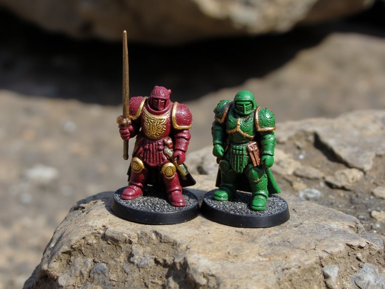
Complementary color pairs create the strongest visual contrast available on the color wheel, positioning red opposite green, blue opposite orange, and yellow opposite violet at exactly 180-degree intervals.
You’ll achieve maximum color impact by using these opposing pairs strategically. However, pure complementary colors at full saturation can clash unnaturally—think Christmas decoration syndrome with bright red and green.
Instead, vary the values and saturation levels. Pair a muted muddy red with strong green for natural earthiness. Use one color prominently and its complement sparingly as accents. This draws focus to critical elements like weapon edges or facial features.
Consider color emotions when selecting schemes. Warm complementary pairs evoke aggression and energy. Cool combinations suggest mysticism and calm.
Split complementary schemes reduce visual tension while maintaining impact. Neutral colors like brown, grey, black, and white provide excellent accent options without clashing with your primary complementary scheme.
Analogous Color Schemes for Harmonious Miniatures
Most miniature painters discover their greatest successes come from analogous color schemes—combinations of three to five adjacent hues on the color wheel that create natural harmony.
Adjacent hues on the color wheel naturally harmonize, eliminating visual conflict and creating the foundation for miniature painting success.
These color combinations eliminate visual conflict between pigments. You’ll achieve smoother blending since neighboring hues naturally shift into each other.
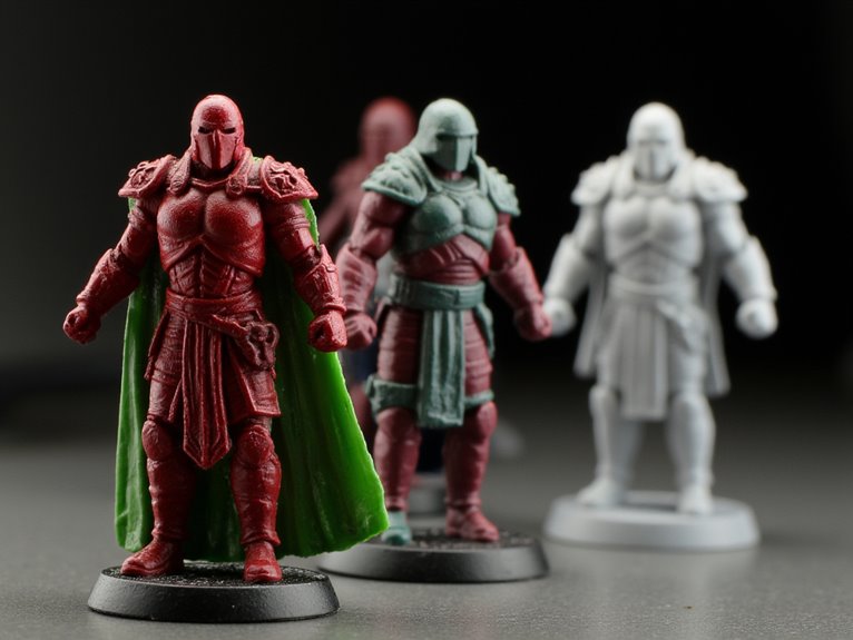
Pure analogous harmony uses three directly adjacent colors exclusively. This produces straightforward harmonious designs like Salamander marines painted with green, yellow-green, and yellow tones.
Extended analogous harmony expands your palette by including edge colors for increased contrast while maintaining cohesion.
Your painting techniques benefit greatly from analogous schemes. Gradients blend more easily.
Shadow work appears natural. Decision-making simplifies since you’re working within a limited but rich tonal range.
Start by selecting your dominant color, then choose two supporting adjacent hues to establish your foundation palette.
Selecting Your Dominant Color Strategy

Before you apply any paint to your miniature, you must establish which color will dominate your scheme and drive all subsequent decisions. Your dominant color sets the foundation for all other choices. This color typically covers 40-60% of your miniature’s surface area and determines the overall visual impact.
Consider these strategic approaches:
- Theme-based selection – Choose colors that reflect your miniature’s role, such as blue for nobility or red for aggression.
- Color symbolism analysis – Research the psychological impact of colors to reinforce character traits.
- Cultural significance integration – Incorporate colors that align with your miniature’s fictional or historical background.
Your dominant color choice influences contrast opportunities, harmony possibilities, and viewer perception. Primary colors offer maximum flexibility for mixing. Warm colors advance visually, while cool colors recede.
Test your selection on practice surfaces before committing to your miniature.
Achieving Color Harmony Through Temperature Balance
While your dominant color establishes the foundation, temperature balance determines whether your miniature achieves visual harmony or falls into chaotic discord.
Temperature dynamics operate through warm-to-cool ratios of 70-30 or 80-20 for ideal visual cohesion. Equal temperature splits create visual tension that disrupts design principles.
Maintain temperature dominance at 70-30 ratios to achieve visual harmony—equal splits generate disruptive tension that undermines compositional unity.
Your palette strategies should anchor around one temperature family. Warm-dominant schemes generate energy and emotional impact suitable for heroic characters. Cool-dominant palettes evoke stealth and mystery, enhancing narrative influence through calculated color interactions.
Apply glazing techniques using temperature-specific washes to unify your scheme. Position warm tones on focal areas like faces while using cool colors for armor or backgrounds.
This strategic placement supports visual storytelling by guiding viewer attention. Neutral tones like greige smooth temperature shifts without compromising your established harmony.
Warm Vs Cool: Creating Visual Interest With Temperature Contrast
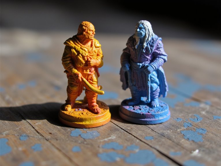
Temperature contrast elevates your miniature painting beyond basic color harmony into dynamic visual storytelling. Warm colors advance toward viewers while cool colors recede, creating three-dimensional depth that value alone can’t achieve. This temperature dynamics principle transforms flat surfaces into convincing forms.
Essential Temperature Contrast Applications:
- Environmental Accuracy – Arctic scenes require cool-dominant palettes, while desert environments demand warm undertones for authentic color perception.
- Light Source Modeling – Position warm highlights on light-facing surfaces and cool shadows on receding areas to enhance dimensional illusion.
- Material Differentiation – Use temperature shifts to distinguish between metal (cool) and leather (warm) surfaces effectively.
Balance prevents garish results. Neutral tones buffer extreme contrasts while preserving visual tension. Each color family contains warmer and cooler variants—analyze these relationships during mixing for controlled temperature dynamics that support your narrative goals.
Monochromatic and Split-Complementary Schemes for Beginners
When you’re starting with color theory, monochromatic schemes offer the most straightforward path to creating cohesive miniatures using only one color’s various tints, shades, and tones.
Split-complementary schemes add controlled complexity by pairing your base color with two colors adjacent to its direct opposite on the color wheel.
You’ll master fundamental color relationships through these approaches while avoiding the chaos that multiple competing hues can create on small-scale models.
Understanding Monochromatic Color Schemes
As you begin exploring color schemes in miniature painting, monochromatic approaches offer the most straightforward path to achieving visually cohesive results. You’ll work with variations of a single hue, adjusting only tone and value through tints, shades, and saturation changes. This technique emphasizes depth emphasis through strategic light-dark contrast rather than competing colors.
Monochromatic schemes provide three key advantages:
- Simplified color mixing – You’ll focus on adding whites, blacks, or grays to your base color.
- Enhanced skill development – Monochromatic textures become more pronounced when color distraction is eliminated.
- Faster workflow – Fewer pigments mean quicker paint preparation and application.
Start with mid-tone base coats, then apply darker washes for shadows and lighter dry-brushing for highlights.
This systematic approach builds fundamental shading skills while producing professionally unified miniatures.
Split-Complementary Basics Explained
Split-complementary color schemes expand your palette options while maintaining the visual harmony you’ve developed through monochromatic practice. This approach uses one base color plus the two colors adjacent to its direct complement on the color wheel. For example, blue pairs with yellow-orange and red-orange instead of straight orange.
These color combinations create dynamic contrast without the harsh clash of true complementary schemes. You’ll achieve visual depth through three distinct hues while maintaining balance. The scheme works exceptionally well for miniature painting techniques because it prevents overwhelming small-scale details.
Apply the 60-30-10 rule: use your base color for 60% coverage, first supporting color for 30%, and accent color for 10%. This proportion guarantees visual cohesion while maximizing the scheme’s contrasting benefits.
Practical Application Techniques
Before you tackle complex color schemes, mastering practical application techniques for monochromatic and split-complementary schemes will establish your foundational skills.
Start with mid-tone base coats using thin layers for smooth coverage. Monochromatic shading requires mixing your base color with black or darker complementary hues to maintain harmony.
Key techniques for effective paint layering:
- Progressive thinning – Dilute paints gradually to build saturation while preserving miniature details.
- Glazing method – Apply transparent layers to create smooth transitions without harsh edges.
- Wash application – Use diluted paints in recesses and folds for natural depth.
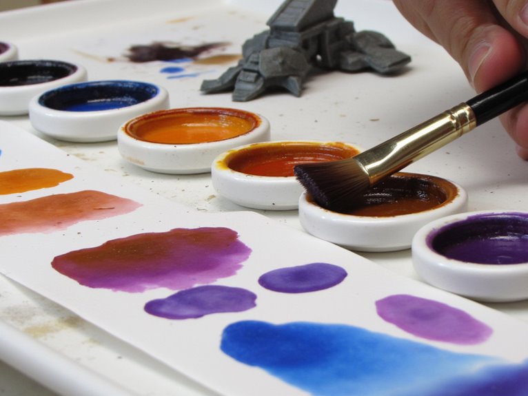
Test color mixes on your palette before application.
Work from dark to light tones, adjusting opacity based on miniature texture. Document successful combinations for consistency across multiple pieces.
Using Neutral Colors to Balance Your Palette
Three types of neutral colors form the backbone of effective miniature painting palettes: true neutrals like black, white, and grey; warm neutrals containing subtle orange or red undertones; and cool neutrals with blue or purple hints.
Neutral warmers bridge temperature contrasts between opposing hues, creating color cohesion across your miniature. These colors provide expanded palettes without introducing competing hues.
Value shifts become smoother when you incorporate neutrals as mixing agents. Natural browns and greys offer visual rest between saturated areas, preventing eye fatigue. Selective saturation works best when 60-70% of your miniature uses neutral tones.
Shading methods improve dramatically with tonal variety from neutrals. Mix warm neutrals with reds and yellows for realistic flesh tones.
Cool neutrals complement blues and purples effectively, maintaining palette harmony while adding sophisticated depth. Professional painters often enhance these neutral foundations with miniature washes, which flow into recesses to create natural-looking shadows and depth without overpowering your carefully balanced color scheme.
Modulating Value to Create Volume and Depth
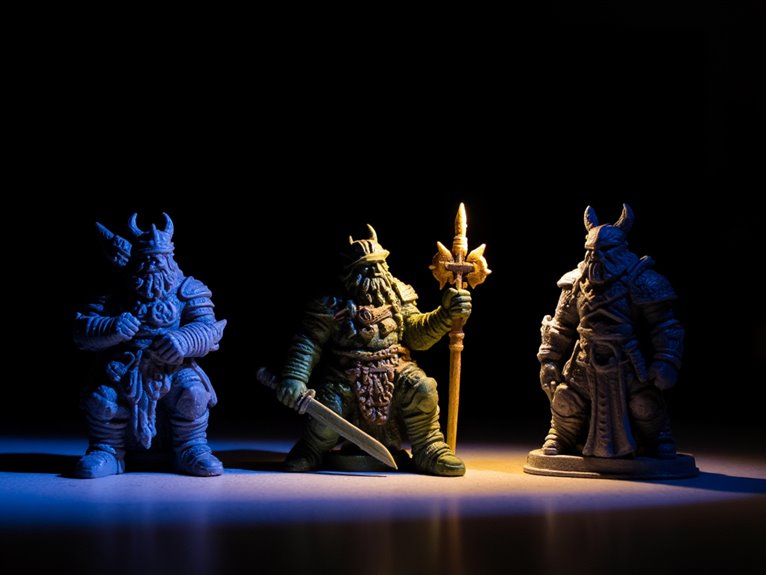
While neutral colors establish palette harmony, value modulation transforms flat surfaces into convincing three-dimensional forms through controlled light source direction and shadow placement.
Value modulation breathes life into miniatures by strategically directing light and shadow across surfaces to create dimensional realism.
This technique creates visual depth through systematic tonal progression from dark shadows to bright highlights.
Essential Value Modulation Steps:
- Establish your light source – Determine ambient light direction before applying any highlight technique or shadow placement.
- Build layered transparency – Apply 4-5 thin coats progressing from base tone to final highlights for smooth surface curvature.
- Control color interaction – Balance contrast intensity to maintain miniature readability without creating unnatural effects.
Airbrushing delivers superior feathering on curved surfaces like turrets and hulls. Fine brushes handle crisp edge highlights on rivets and hatches.
This methodical approach simulates natural light behavior across complex miniature geometry. Professional stay wet palettes help maintain paint consistency across multiple thin layers, preventing color shifts that can disrupt your carefully planned value progression.
Adjusting Chroma for Visual Hierarchy and Focus
You can create powerful visual hierarchy by strategically placing high-chroma colors at focal points while using desaturated tones for supporting elements throughout your miniature.
This chroma contrast naturally guides the viewer’s eye to important details like faces, weapons, or magical effects without relying solely on value changes.
Implementing gradual chroma shifts between these saturated focal areas and muted backgrounds establishes smooth visual flow while maintaining clear emphasis on your miniature’s most critical storytelling elements.
High Chroma Focal Points
How can a single brushstroke of vibrant color transform your miniature from a collection of painted details into a compelling focal narrative? High chroma advantages stem from saturated colors’ natural ability to command visual attention instantly. Your eye gravitates toward pure, intense colors amid muted surroundings, creating clear hierarchical structure.
Effective focal point strategies require strategic application:
- Apply high chroma colors over mid-tone bases to preserve saturation while maintaining dimensional form definition.
- Use lighter shadows in high chroma regions to prevent color dulling and maintain vibrancy throughout the focal area.
- Limit high chroma placement to key narrative elements to avoid visual scatter and maintain concentrated impact.
True hues at medium values deliver maximum chromatic intensity. Avoid overly dark shadows that compromise color purity.
Balance saturated focal points with desaturated surroundings for ideal visual hierarchy control.
Desaturated Supporting Elements
Strategic desaturation transforms supporting elements into visual anchors that guide viewer attention without competing for prominence. You’ll achieve this by reducing chroma in secondary details while maintaining high saturation in focal points.
Desaturated aesthetics emerge through careful color mixing—blend complementary hues toward neutral greys or apply thin glazes over greyscale bases. Muted tones create visual hierarchy effectively. Background elements painted with lowered chroma recede naturally, preventing visual clutter.
You can use diluted washes or controlled drybrushing to apply these subdued colors without losing sculptural detail. Balance remains critical. Excessive desaturation creates flat, lifeless miniatures.
Limit muted areas to supporting details like weathered leather, aged metal, or secondary fabric elements. This approach maintains adequate contrast while establishing clear narrative focus on your miniature’s primary features.
Chroma Gradient Techniques
Chroma gradients control visual flow across your miniature by systematically varying color saturation from high to low intensity.
You’ll create focal hierarchies that guide viewer attention through deliberate chroma shifts. High-saturation areas become natural focal points, while desaturated zones recede into supporting roles.
Essential Chroma Shift Techniques:
- Layered Saturation Building – Apply multiple semi-transparent layers, reducing coverage area with each application to create smooth chroma transitions from base to highlight zones.
- Gradient Brush Techniques – Use consistent brushstroke direction toward highlight centers, maintaining thin paint consistency to prevent harsh color breaks between saturation levels.
- Glazing Integration – Apply transparent color layers over base gradients to fine-tune chroma intensity without disrupting underlying shifts.
Multiple successive layers between extreme chroma values produce professional-quality gradients that enhance your miniature’s three-dimensional appearance.
Color Psychology and Storytelling in Miniature Characters
When you apply color to a miniature character, you’re wielding one of the most powerful narrative tools available to painters.
Color choices establish emotional resonance through psychological triggers that operate below conscious awareness. Red activates aggression and urgency, while blue induces calm or melancholy responses.
Color symbolism reinforces artistic intention by linking specific hues to character traits. Dark, muted palettes signal mystery or menace. Bright, saturated schemes indicate heroism or liveliness.
Your color contrast decisions highlight internal character conflicts through complementary pairings.
Temperature harmony drives narrative depth. Warm colors suggest approachability; cool tones imply distance or secrecy.
Character identity emerges through consistent faction themes and cultural color coding.
Color evolution across painting series reflects story arcs, creating sustained viewer engagement through visual emotional narrative development.
Practical Application Techniques: Glazing, Layering, and Planning
Although color theory provides the foundation for effective miniature painting, mastering glazing and layering techniques transforms theoretical knowledge into tangible results on your models.
Bridging the gap between color theory and practice requires mastering glazing and layering to achieve professional miniature painting results.
Essential techniques for professional-quality miniatures:
- Glazing techniques require severely thinned paint applied in 2-3 translucent layers to achieve smooth color shifts without opacity loss.
- Layering strategies build solid coverage through successive coats of undiluted paint, creating crisp edges and detailed highlights.
- Paint consistency control involves removing excess water from brushes and maintaining uniform dilution ratios across applications.
Effective tonal adjustments depend on strategic planning. Identify base tones and target highlights before beginning paint application.
Use layering for foundational colors, then apply glazing for subtle color saturation modulation. This combination balances vibrancy with realistic gradients while preserving miniature details underneath.
Professional-grade results also benefit from using high-quality acrylic paints that offer exceptional adherence and complete opacity for both brush and airbrush applications.
On a final note
You’ve now mastered color theory‘s fundamental principles for miniature painting. Apply the color wheel systematically to achieve specific visual effects. Use complementary colors for dramatic contrast and analogous schemes for harmony. Control value and chroma to direct viewer attention and create depth. Remember that color choices directly impact your miniature’s narrative impact. Practice these techniques consistently. Your understanding of hue relationships, value modulation, and chroma adjustment will elevate your painting quality considerably.