We are supported by our audience. When you purchase through links on our site, we may earn an affiliate commission, at no extra cost for you. Learn more. Last update on 1st July 2025 / Images from Amazon Product Advertising API.
You’ll master miniature color mixing by understanding primary color relationships and controlling hue, value, and chroma properties. Mix secondary colors using equal parts of primaries, then create custom earth tones with camo black brown, flat Earth, and leather brown at 1:1 or 1:2 ratios. Apply controlled washes at 8:1 water-to-paint ratios for smooth shifts. Avoid mixing more than two hues simultaneously to prevent muddiness, and always blend white or black instead of using them pure. These fundamentals open up advanced techniques that elevate your painting quality considerably.
Notable Insights
- Mix primary colors (red, blue, yellow) in equal parts to create secondary colors, then blend with primaries for tertiary variations.
- Use 1:1 or 1:2 ratios when mixing colors and avoid combining all three primaries simultaneously to prevent muddy results.
- Create natural highlights and shadows by mixing white or complementary colors rather than using pure white or black.
- Apply thin layers at 8:1 to 10:1 water-to-paint ratios for smooth transitions and effective color blending techniques.
- Document exact color formulas and environmental conditions for consistent, repeatable results in future painting sessions.
Understanding Primary and Secondary Color Relationships
When you’re starting your journey into miniature painting, understanding primary and secondary color relationships forms the foundation of all effective color mixing.
Primary colors—red, blue, and yellow—cannot be created by mixing other pigments. These fundamental hues serve as building blocks for your entire palette.
Secondary colors emerge when you combine two primaries in equal parts: blue plus yellow creates green, red plus yellow produces orange, and red plus blue yields purple.
This color theory principle guides all advanced mixing techniques. The color wheel positions secondary colors equidistant between their parent primaries.
The color wheel’s geometric arrangement creates a visual map that predicts how pigments will interact when combined.
This spatial arrangement predicts color interactions and identifies complementary pairs—colors positioned opposite each other that create maximum contrast. When working with achromatic colours like black, white, and grey, these integrate well without clashing with other hues in your palette. Beyond primary and secondary colors, tertiary colors form when you mix a primary with an adjacent secondary color, creating nuanced hues like yellow-green or red-orange that expand your mixing possibilities.
Understanding these relationships allows you to achieve deliberate visual harmony and contrast effects essential for compelling miniature work. For beginners developing their color mixing skills, complete opacity ensures that mixed colors maintain their intended vibrancy and coverage on the miniature surface.
Mastering Hue, Value, and Chroma Properties
You’ll need to master three core color properties—hue, value, and chroma—to achieve professional-quality results when mixing miniature paints.
Hue determines the actual color identity (red, blue, yellow). Value controls the lightness or darkness of that color, and chroma defines how vivid or muted the color appears. Muted ofcolours are dulled versions achieved by mixing with gray, black, or white.
Understanding how these properties interact lets you predict mixing outcomes and maintain consistent color relationships across your entire miniature. High-concentration pigments in acrylic paints yield rich, intense colors and enhance surface details when creating your color mixes. When working with warm colors like reds, oranges, and yellows, you’ll create energetic and exciting effects that naturally evoke feelings of warmth and intensity.
Understanding Color Properties
Before you can mix colors effectively for miniatures, you must understand the three fundamental properties that define every color: hue, value, and chroma.
These dimensions work independently but combine to create every perceivable color you’ll encounter in miniature painting.
Hue identifies the color’s position on the spectrum—red, blue, green, and others. Different objects can share the same hue even when they appear quite different, such as a fire truck and a strawberry both displaying red.
Value measures lightness or darkness compared to white and black. The value scale ranges from 0 for black to 10 for white, with neutral grays serving as intermediates between these extremes.
Chroma determines color purity and intensity relative to gray.
Understanding color theory and color perception helps you achieve proper color harmony while considering color psychology effects on viewers.
Key benefits of mastering these properties:
- Prevents muddy colors during paint layering and mixing processes
- Creates realistic lighting effects through systematic value adjustments
- Achieves material authenticity by controlling chroma for weathered or vibrant surfaces
Controlling Paint Characteristics
Once you grasp the fundamental color properties, controlling them becomes the cornerstone of professional miniature painting results. You’ll master three essential elements through strategic mixing techniques.
Hue control requires understanding complementary and analogous relationships. Complementary colors create vibrant contrast, while analogous schemes produce unified, natural appearances. Split-complementary and triadic arrangements offer balanced visual depth without overwhelming fine details.
Value manipulation defines form and dimension. Add white to increase lightness for highlights. Mix darker pigments to create shadows and depth. Layering techniques enable gradual value shifts across curved surfaces.
Chroma adjustment controls color intensity. Desaturate using complementary mixes or neutral grays for weathered effects. Understanding color warmth serves as your guide for enhancing the overall mood and emotional impact of your miniature scenes.
| Property | High Effect | Low Effect | Technique |
|---|---|---|---|
| Hue | Vibrant contrast | Subtle harmony | Complementary mixing |
| Value | Bright highlights | Deep shadows | White/black addition |
| Chroma | Pure saturation | Muted tones | Color blending |
| Shift | Sharp definition | Smooth gradients | Wet blending |
Creating Highlights and Shadows With White and Black
When you’re ready to add dimension to your miniatures, understanding how to properly use white and black for highlights and shadows becomes essential for achieving realistic results.
Direct application of pure white creates desaturated, pastel highlights that appear unnatural. Pure black produces muddy, lifeless shadows lacking vibrancy.
Effective highlight techniques require mixing white with warm or cool tints rather than using stark white. Shadow variations work best when you blend the base color with complementary hues instead of adding black alone.
Blend white with color tints for natural highlights and mix base colors with complementary hues for vibrant shadows.
Key principles for dimensional painting:
- Mix complementary colors with your base tone to create vibrant shadows
- Tint white with colored hints for natural-looking highlights
- Layer thin coats gradually rather than applying solid blocks
This approach maintains color saturation while creating authentic depth and contrast. For enhanced shading effects, consider applying miniature washes over your mixed colors to further deepen shadows and create realistic weathering on your models.
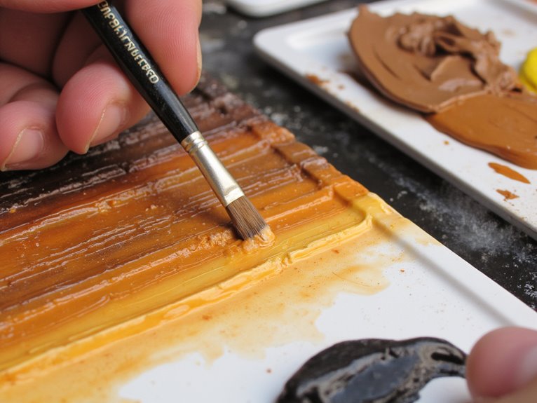
Developing Custom Brown and Earth Tone Recipes
Although pure brown paints from the bottle might seem sufficient, developing custom brown and earth tone recipes transforms your miniature painting from basic to professional quality. Color theory applications guide effective mixing decisions by recognizing undertones in base pigments. Red or green hints dramatically affect final hues and weathering effects.
Start with essential bases: camo black brown, flat Earth, and leather brown. Mix these at 1:1 or 1:2 ratios depending on desired intensity. Dark brown combines black brown and flat Earth pigments effectively. Adding leather brown increases warmth for natural wood textures.
Pigment blending techniques require proper thinning ratios around 1:3 paint to thinner. Layer progressively from dark bases to light highlights using pure flat brown.
Test mixtures on spare surfaces before applying to miniatures for consistent, realistic earth tones.
Building Smooth Color Transitions Through Blending
Mastering smooth color changes separates amateur miniature painting from professional-quality results that capture realistic lighting and dimensional depth.
Professional blending techniques require specific paint consistencies and methodical application. Start with an even mid-tone base coat, then apply controlled washes at 8:1 to 10:1 paint-to-water ratios for gradual color gradients.
- Wet blending: Apply adjacent colors while wet, using zigzag brush motions to merge boundaries before paint dries.
- Layered dry brushing: Build 20-30 ultra-light coats on raised surfaces, gradually shrinking brush coverage areas.
- Progressive washing: Layer multiple thin washes to create smooth tonal shifts without harsh edges.
Speed matters for wet blending—work quickly or use retarding mediums.
Multiple light layers consistently outperform single heavy applications for achieving professional-quality transitions.
A stay-wet palette maintains paint workability for extended periods, preventing colors from drying out during complex blending sessions and allowing for consistent paint consistency throughout your work.
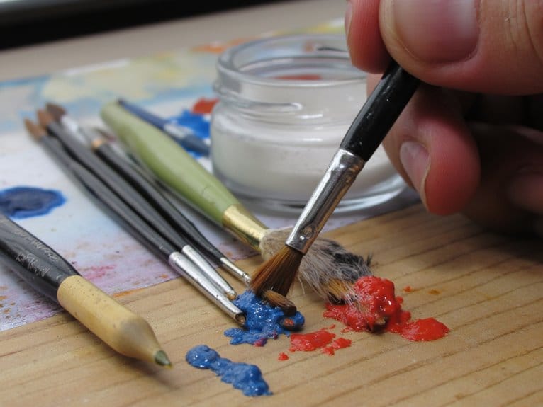
Setting Up Your Mixing Palette and Workspace
Since proper palette organization directly impacts color accuracy and painting efficiency, you’ll need to establish a systematic workspace before mixing your first colors.
Position your palette within arm’s reach of your miniature to minimize movement during painting. Use non-absorbent surfaces like ceramic or glass for easy cleanup and color longevity. Arrange colors logically by temperature or tone, keeping warm and cool variants separated. Allocate adequate mixing space between main colors for intermediate shades.
Your workspace organization requires consistent daylight-balanced lighting to judge colors accurately. Keep water containers, brushes, and palette knives organized nearby for streamlined workflow. Maintain a clutter-free area to prevent accidental spills. Use comfortable seating and adjustable holders for extended sessions.
Consider incorporating a wet palette system to maintain paint workability for 8+ hours and reduce paint waste by 60-80%.
This systematic palette setup builds muscle memory and improves painting efficiency across multiple projects.
Selecting Appropriate Colors for Theme and Atmosphere
Why do certain miniature paint schemes immediately convey heroic nobility while others suggest sinister malevolence? Your theme selection directly determines atmosphere impact through strategic color choices.
Color mood establishes narrative influence before viewers examine details. Understanding color temperature drives emotional palette decisions. Warm colors create aggressive, energetic atmospheres. Cool tones suggest mystery or tranquility. Your character portrayal depends on balancing these temperatures effectively.
- Apply the 60/30/10 proportion rule: dominant color sets overall mood, secondary adds depth, accent highlights focal points.
- Use analogous harmony for thematic consistency by selecting adjacent color wheel positions.
- Leverage color symbolism for color storytelling—red conveys leadership, blue suggests mysticism, darker shades imply menace.
Base colors establish thematic atmosphere before adding highlights. Adjust saturation to intensify or soften mood impact. High saturation signals importance and draws attention to key narrative elements.
Advanced Techniques for Texture and Depth Effects
You’ll achieve professional-level miniatures by mastering three critical advanced techniques that transform flat surfaces into convincing three-dimensional forms.
Layered glazing methods build translucent depth through multiple thin applications of diluted paint at 8:1 to 10:1 water ratios, while stippling creates authentic surface textures by applying controlled dots of contrasting colors with brush tip contact.
Color temperature changes enhance realism by shifting from warm highlights to cool shadows, mimicking how natural light interacts with different surface materials.
Layered Glazing Methods
When you’re ready to achieve museum-quality finishes on your miniatures, layered glazing transforms ordinary paint jobs into works of art with extraordinary depth and realism.
These glazing techniques require precise paint dilution ratios to create transparent layers. Mix acrylic paint with medium or water until you achieve a translucent consistency.
Color layering builds gradually through multiple thin applications—never rush with thick coats.
Load your brush carefully to prevent pooling. Apply gentle strokes across targeted areas, maintaining even coverage. Each layer must dry completely before applying the next. This methodical approach creates seamless gradients and enhances the three-dimensional appearance.
- Prepare custom glazes by thinning paint to translucent consistency for ideal transparency
- Apply ultra-thin coats using controlled brush strokes to prevent streaking and maintain smoothness
- Build depth gradually through sequential layering for natural-looking shadow and highlight changes
Stippling for Surface Texture
You’ll achieve ideal results using stippling brushes or worn round brushes with properly thinned paint.
Balance consistency carefully—paint that’s too thick creates smears, while overly thin paint produces weak marks. Load your brush evenly and dab lightly to prevent clumping.
These stippling techniques excel at creating realistic texture effects on armor edges and raised details.
Layer different colors to build natural depth. Combine stippling with washes for enhanced shadow definition. The method covers large areas efficiently while maintaining precise control over weathering patterns.
Color Temperature Transitions
How can color temperature transform flat miniature surfaces into convincing three-dimensional forms? Temperature psychology drives visual perception—warm colors advance while cool tones recede. This fundamental principle creates depth without relying solely on traditional highlights and shadows.
Warm reds, yellows, and oranges push forward from surfaces, making details appear prominent. Cool blues, greens, and purples sink backward, establishing natural recession. Strategic temperature positioning simulates atmospheric influence across your miniature’s environment.
Effective temperature changes require 2-3 gradient hues maximum. Wet blending prevents chalky appearances between distant colors. Apply thin paint layers for smooth progressions.
- Use warm tones on raised texture areas to enhance prominence
- Apply cool colors in recesses to deepen shadow perception
- Blend temperature shifts gradually across curved surfaces for realism
Temperature-based harmony maintains visual cohesion while amplifying three-dimensional effects through strategic color placement.
Avoiding Common Mixing Mistakes and Pitfalls
Although color mixing opens creative possibilities for miniature painters, several common mistakes can quickly turn promising paint combinations into disappointing muddy messes. Avoid mixing more than two hues simultaneously, especially when combining all three primaries. This creates earth tones that lack color clarity due to complex chroma adjustments.
Match hue values before mixing to prevent unwanted dominance and value shifts. Directly mixing paints straight from tubes with mismatched values causes unintended darkening. Don’t rescue muddy mixtures by adding more colors—this exacerbates the problem.
Control your mixing ratios precisely using calibrated tools. Inconsistent proportions affect paint viscosity and drying time.
Select compatible hues from the same temperature family to maintain vibrancy. Cool reds mixed with warm blues produce dull secondaries instead of vibrant ones.
Maintaining Color Consistency Across Painting Sessions
Beyond avoiding immediate mixing errors, achieving identical colors across multiple painting sessions requires systematic documentation and precise replication of your formulas.
Consistent color replication demands meticulous formula documentation and systematic approach to paint mixing across extended creative projects.
You’ll need detailed records of exact color components and quantities for each mixed color. Use digital or mechanical scales for repeatability, maintaining water-to-paint ratios between 8:1 and 10:1 for consistent transparency.
Essential color retention tips include:
- Document environmental conditions – Record humidity and temperature, as these factors affect drying times and color appearance
- Implement proper paint storage solutions – Store leftover mixed paint in sealed containers, refrigerated when necessary to extend usability
- Photograph samples under consistent lighting – Use the same workspace lighting setup to accurately judge color matching between sessions
Stir paint mixtures thoroughly before each use to prevent pigment settling and maintain uniform color density.
On a final note
You’ve now mastered the fundamental techniques for mixing colors effectively on miniatures. Apply these color theory principles consistently across your projects. Practice the blending methods until they become second nature. Your custom color recipes will develop naturally through experimentation. Remember that proper brush control and paint consistency are equally important as color knowledge. These skills will elevate your miniature painting from basic to professional quality results.